 Img src: "depictdatastudio.com"
Topics discussed in this article.
- Introduction to data visualisations.
- Principles of data visualisation design
- Types of Data visualisations and tips.
Creating data visualizations for a presentation or just for practice only gets successful if your users understand what insights you are trying to bring to light.
Every business has a story to tell, and that can be conveyed through data visualizations, according to dataquest.io "data is only as helpful as it is understandable".
Well, for most Data scientists, design is not at the forefront but creating effective charts and visualizations. Although most of the time, these visualizations end up as overdressed charts that confuse and disorients the users and audience.
Here are some design guidelines;
## PRINCIPLES
According to Material Design, data visualization depicts information in a graphical form and should follow these principles.
ACCURACY
Data visualizations should be accurate, of high integrity and should have a clear meaning.
HELPFUL
Data visualizations should help users understand the context of which a group of conditions exist, where and when something happens that emphasises exploration and comparison.
SCALABLE
Data visualizations should be created to adapt to different screen sizes in order to accommodate user needs on data dept, complexity and modality.
## TYPES
Data visualisations can be expressed in different forms. Charts (or graphs) are the most popular way of visualising data.
Trend and over-time charts These charts show the trends and comparisons of data across multiple categories over a period of time.
These charts include:
- Line charts
- Bar charts
- Stacked bar charts
- Candlestick charts
- Area charts
- Timelines
- Horizon charts
- Waterfall charts
Use cases:
- Health statistics.
- Stock price performance,
- Educational statistics.
- Chronologies.
nuggets: Bar charts are very easy to read because they basically allow our eyes to simply compare the relative heights of the bars. For users to draw meaningful conclusions from a bar chart, it has to be presented in full and start from a vertical axis of zero.
Categories comparison: These charts compare data between multiple, varying and distinct elements.
Category comparison charts include:
- Bar charts
- Grouped bar charts
- Bubble charts
- Multi-line charts
- Parallel coordinate charts
- Bullet charts
Part-to-whole
These show how partial elements add up to a whole.
Use cases:
- Analyzing sales of Items of a quarter.
- Survey results.
- Budgets.
- Consolidated revenue of product categories.
Part-to-whole charts include:
- Stacked bar charts
- Pie charts
- Doughnut charts
- Stacked area charts
- Treemap charts
- Sunburst charts
nuggets: Pie charts summarise the individual relationships among elements as a whole. This can be visualized using angles or arcs within a circle.
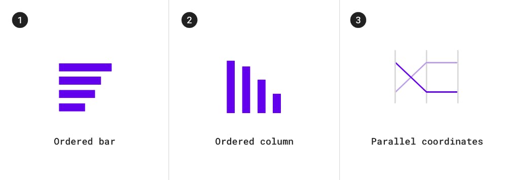
Ranking This shows the positions of items in a list.
Use cases include:
- Election and poll results
- Performance statistics

Ranking charts include:
- Ordered bar charts
- Ordered column charts
- Parallel coordinate charts
Correlation
Correlation charts are mostly used for showing and summarising the association between two variables.
correlation charts include:
- Scatterplot charts
- Bubble charts
- Column and line charts
- Heatmap charts.
nuggets: Heat maps are perfect for representing defined boundaries in a dataset.
..........

Alright Phew!
More data visualisation guidelines and resources used in this article can be found at
- material.io/design/communication/data-visua..
- dataquest.io/blog/design-tips-for-data-viz
- geckoboard.com/learn/data-literacy/data-vis..
Also, feel free to add more guidelines to the list in the comments.
Thanks for reading...
